Neuromyths

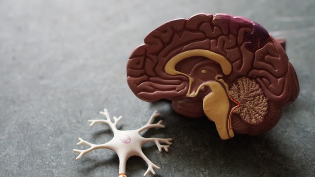
The neuromyths that have proliferated in western society have caused harm to many students. Statements such as a logical left-brained person or creative right-brained person have caused many people to only spend time and energy on certain topics. Often leaving other areas neglected because they did not match with the hemisphere they supposedly aligned with. In UVic’s education program I have heard professors talk about people being visual, audio, or hands-on learners. Thankfully this is addressed and debunked in neuromyth 3. This idea that a person learning best through a single mode of information transfer has lasted too long, and is further disputed by multimedia and modality principles
PowerPoint

As a university student, I have seen many PowerPoint presentations, from faculty and fellow students and there is certainly a range of quality. It would be understandable for students, like myself, to have awkward or confusing PowerPoint slides but I am always put off when this happens during a professor’s lecture.
This week’s content on multi-media presentations gave me a better understanding of why some presentations resonated with me and others were painful to look at. As a person with attention issues, I appreciate when presenters refrain from adding “fun” or “eyecatching” elements to their PowerPoints, as these elements pull all of my attention away from what the speaker is trying to convey. I also encounter problems when reading fonts that are overly decorative with letter collisions. I can read those styles of fonts, but much like having more than six objects per slide increases a person’s cognitive load, so do decorative fonts. Making PowerPoints, or other multi-media presentations is something I feel like I need more practice with. I was happy to see the resources on creating effective multi-media presentations included in this course and will be using them in the future when creating presentations that will support my speaking rather than compete with me and overwhelm my audience.
Hands-on Learning: Presentation
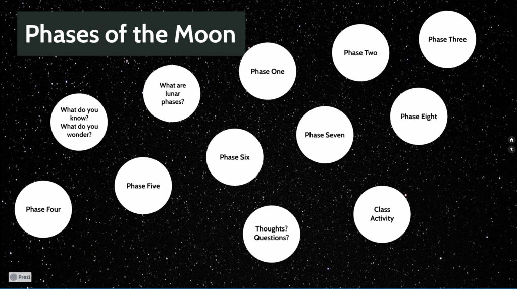
I decided to create a resource that I could use in a grade 4 or 5 class for my hands-on learning this week. The resource is for a lesson on the Earth’s Moon and the lunar cycle.

References
OECD Neuromyths https://www.oecd.org/general/searchresults/?q=Neuromyths&cx=012432601748511391518:xzeadub0b0a&cof=FORID:11&ie=UTF-8
McCue, R. (2020). Principles of Multimedia Learning—A summary. https://docs.google.com/document/d/1TGVFG_iCc3iSz3aX3j8UC-YC63V__6tKFJQ4FtAsH4o/
TEDx Talks. (2014, April 14). How to avoid death By PowerPoint | David JP Phillips | TEDxStockholmSalon [Video]. YouTube. https://www.youtube.com/watch?v=Iwpi1Lm6dFo
Hello and nice to see your blog taking shape. I see you have a great moon cycle resource and glad you could use what you do in 337 for your practice. Whenever you can do that it is great and really a purpose for these assignments.